

Home page

Account
Page
Revamp
The Canada Post account page is a positive example of taking a relatively simple task and, through observation, negotiation and a test-first approach, tacking on some additional updates to validate some hunches and, at the very least, gather some learnings.
In this case it worked out.
ratio of signed in accounts using the app
people using Automatic Tracking within the app
people using MyMail
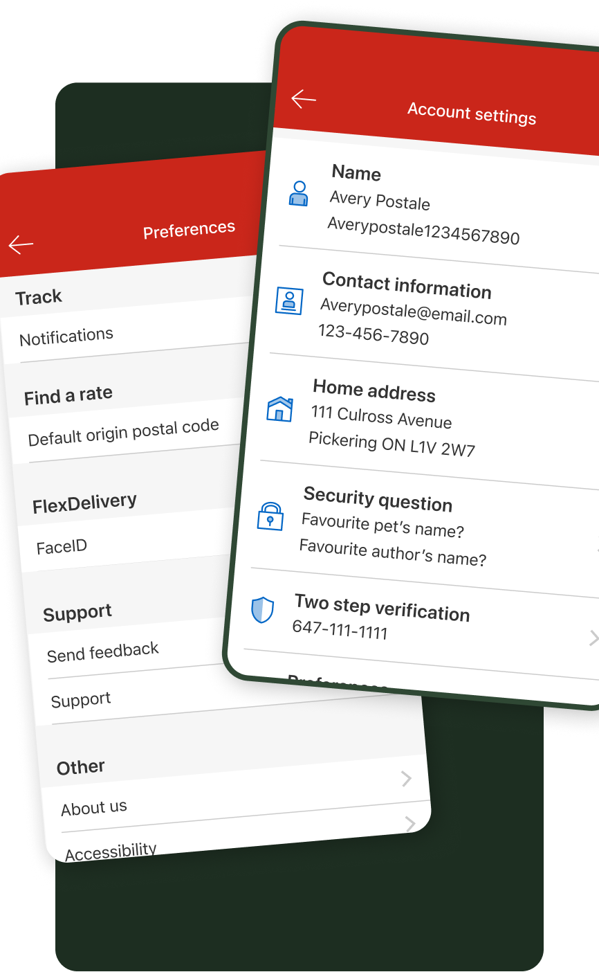
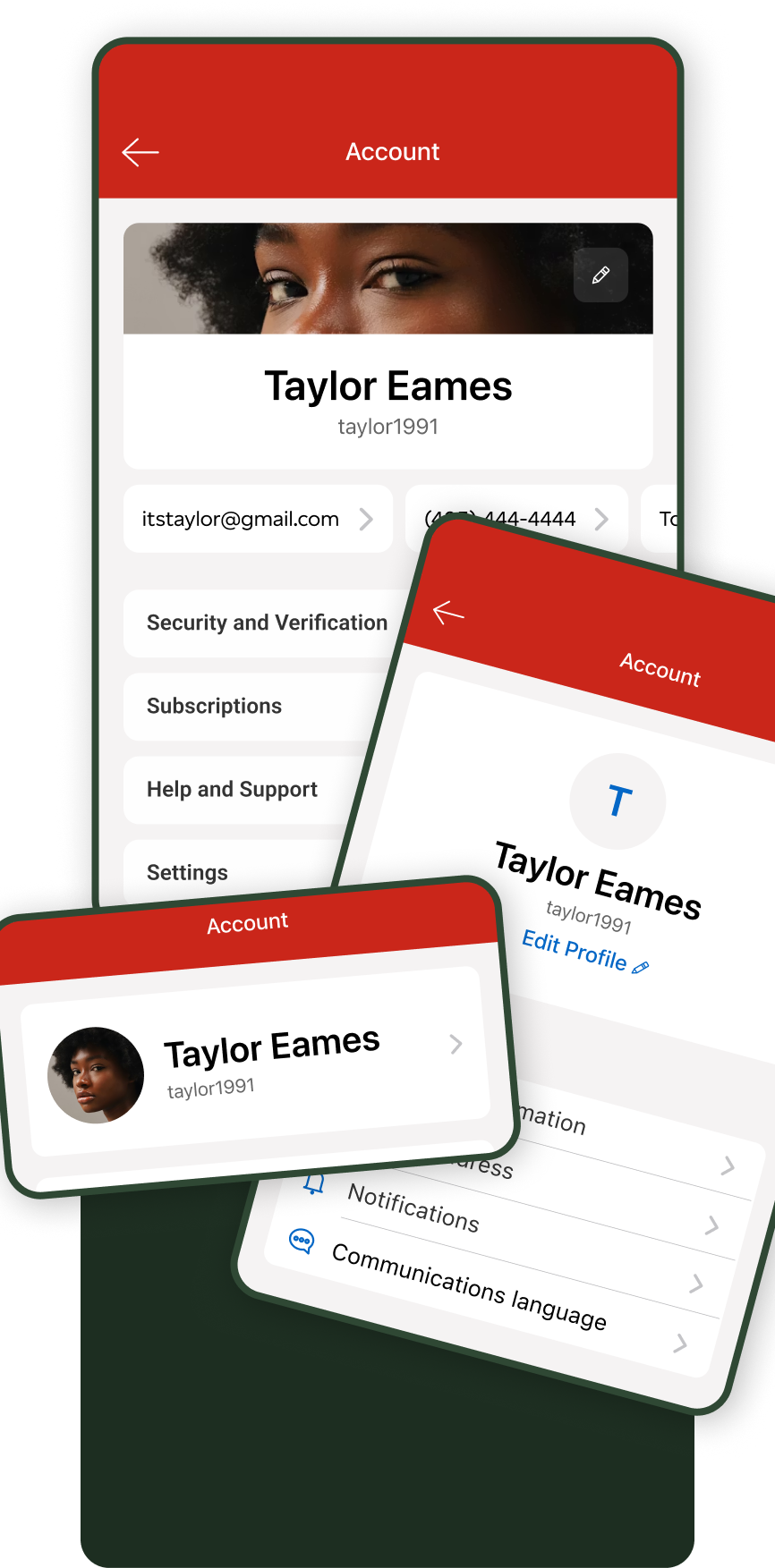
Two pages of the old app that made up the profile and app preferences.
At the time the team was in the early stages of ramping up mobile app resourcing so we needed to tighten up the areas we knew people would be visiting the most.
One such area was the “Account settings” and “Preferences” sections... confusing, right? With duplicate sections, disparate styling, and some revealing interviews it was obvious that there was an opportunity for consolidation and improvement.
Two pages of the old app that made up the profile and app preferences.
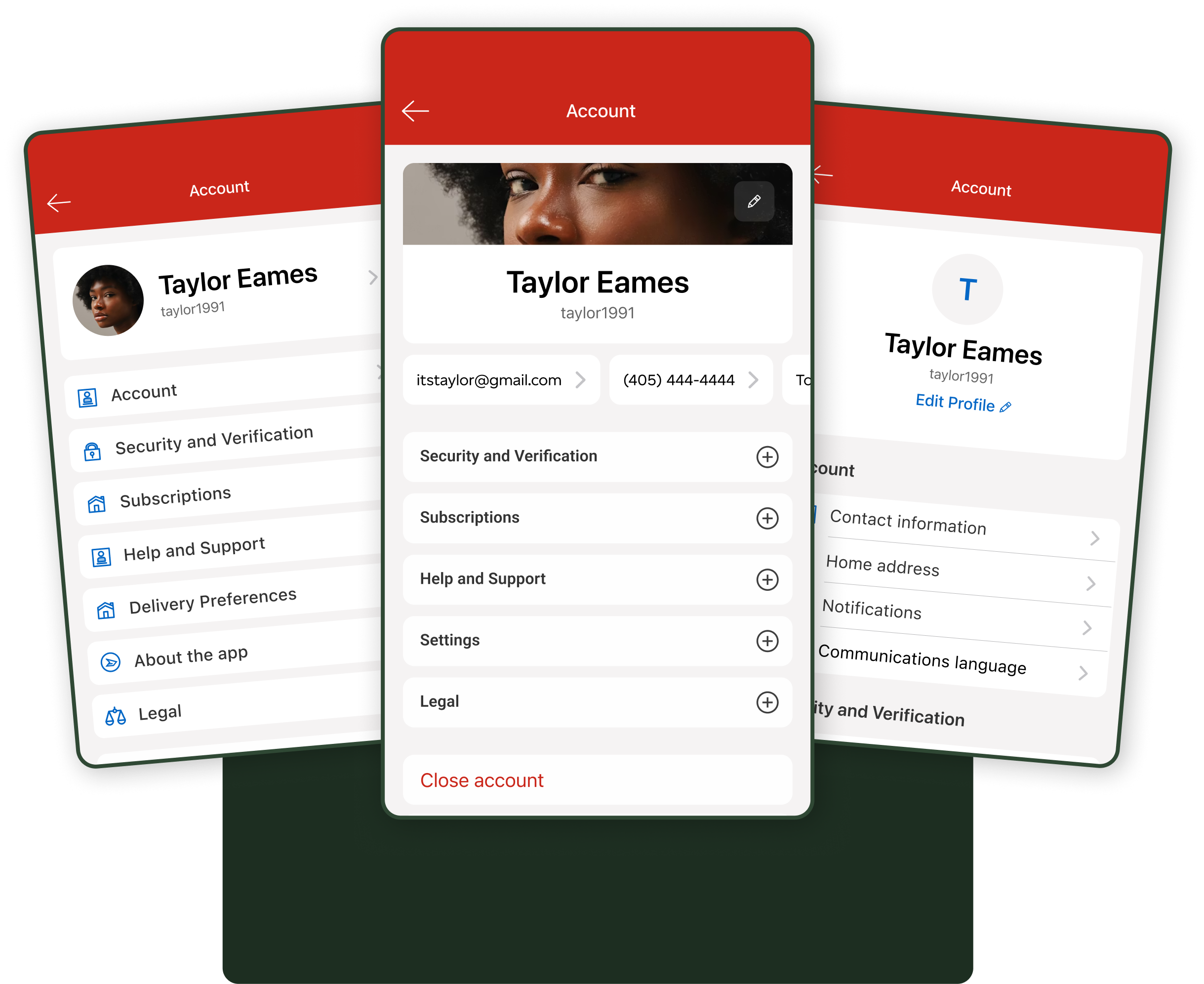
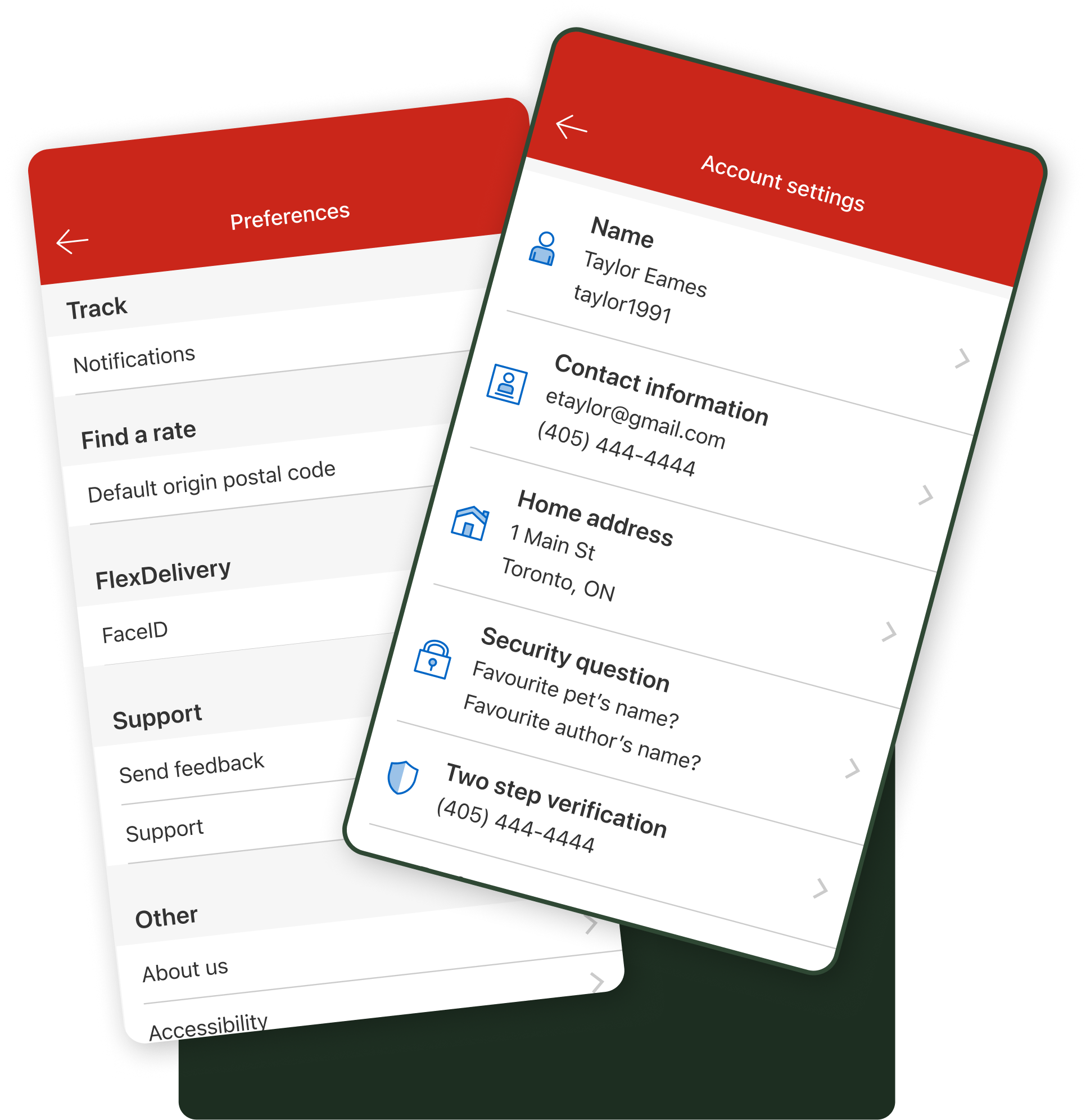
Meeting our basic needs with some iterations of a new integrated settings page design.
With that we worked through the information architecture now that we were merging multiple pages, followed by the visual design to modernize the aesthetic and ended up with a couple different variations to test with users.
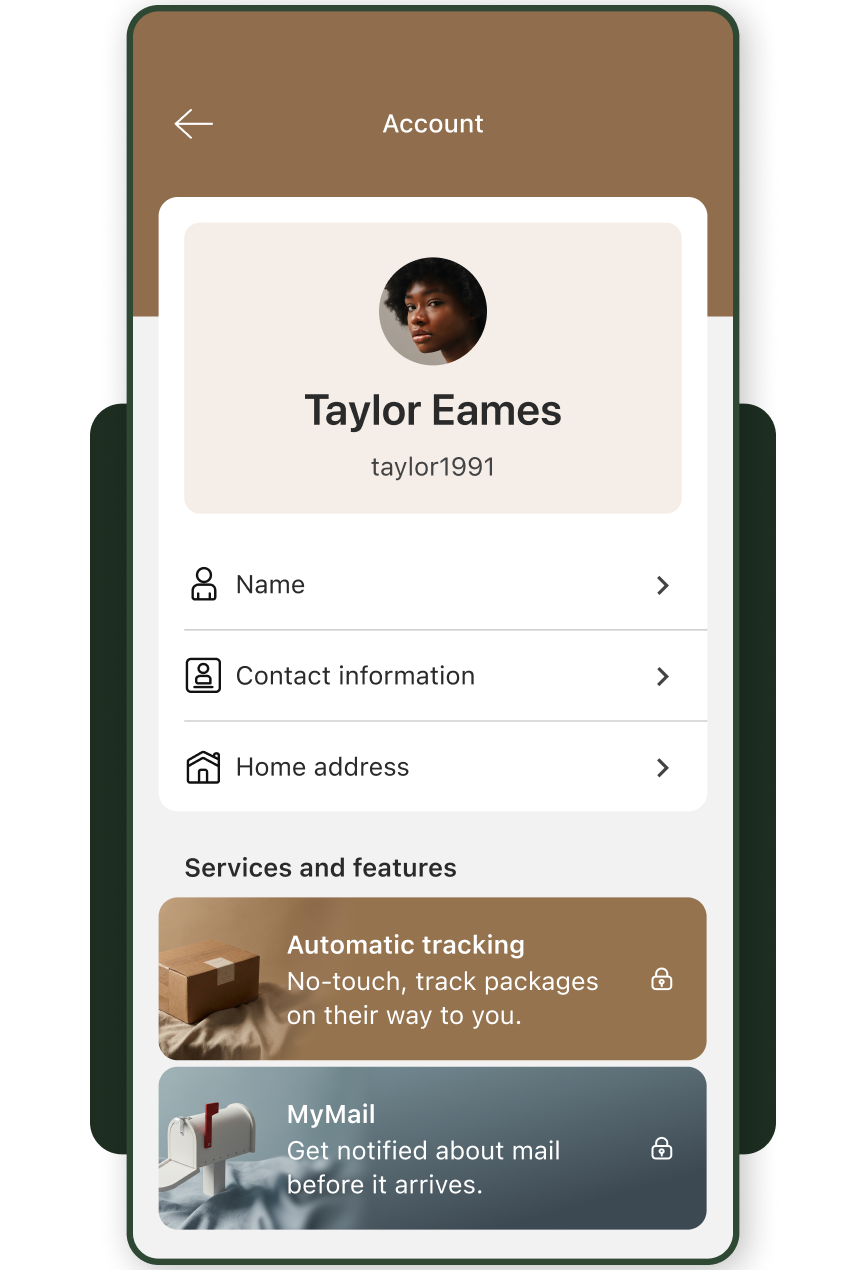
Arguably the funnest part of each project is attempting to sell something that extends somewhat outside of the initial requirements. We knew that this now single page was to be one of our most highly trafficked pages, so why not take advantage?
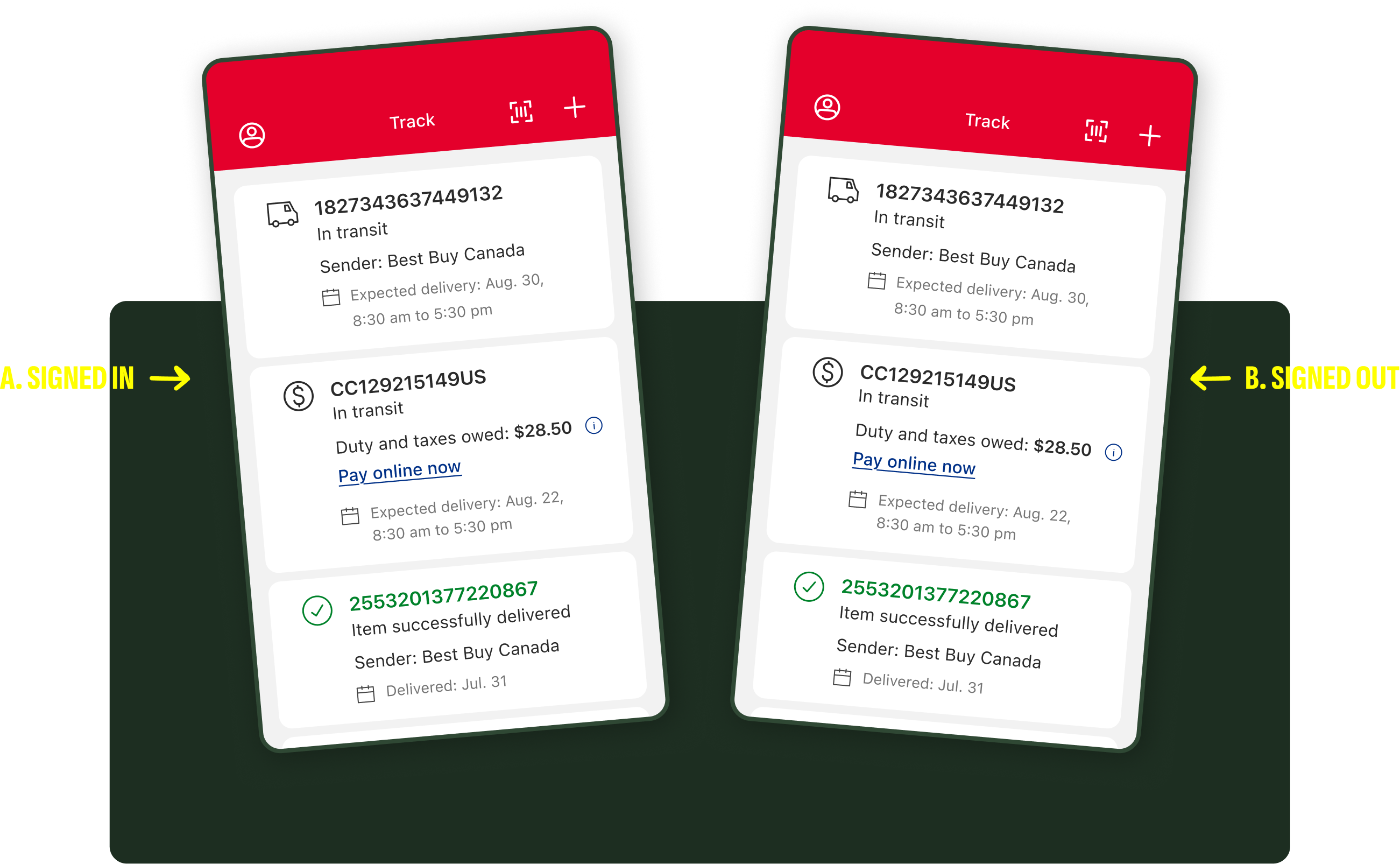
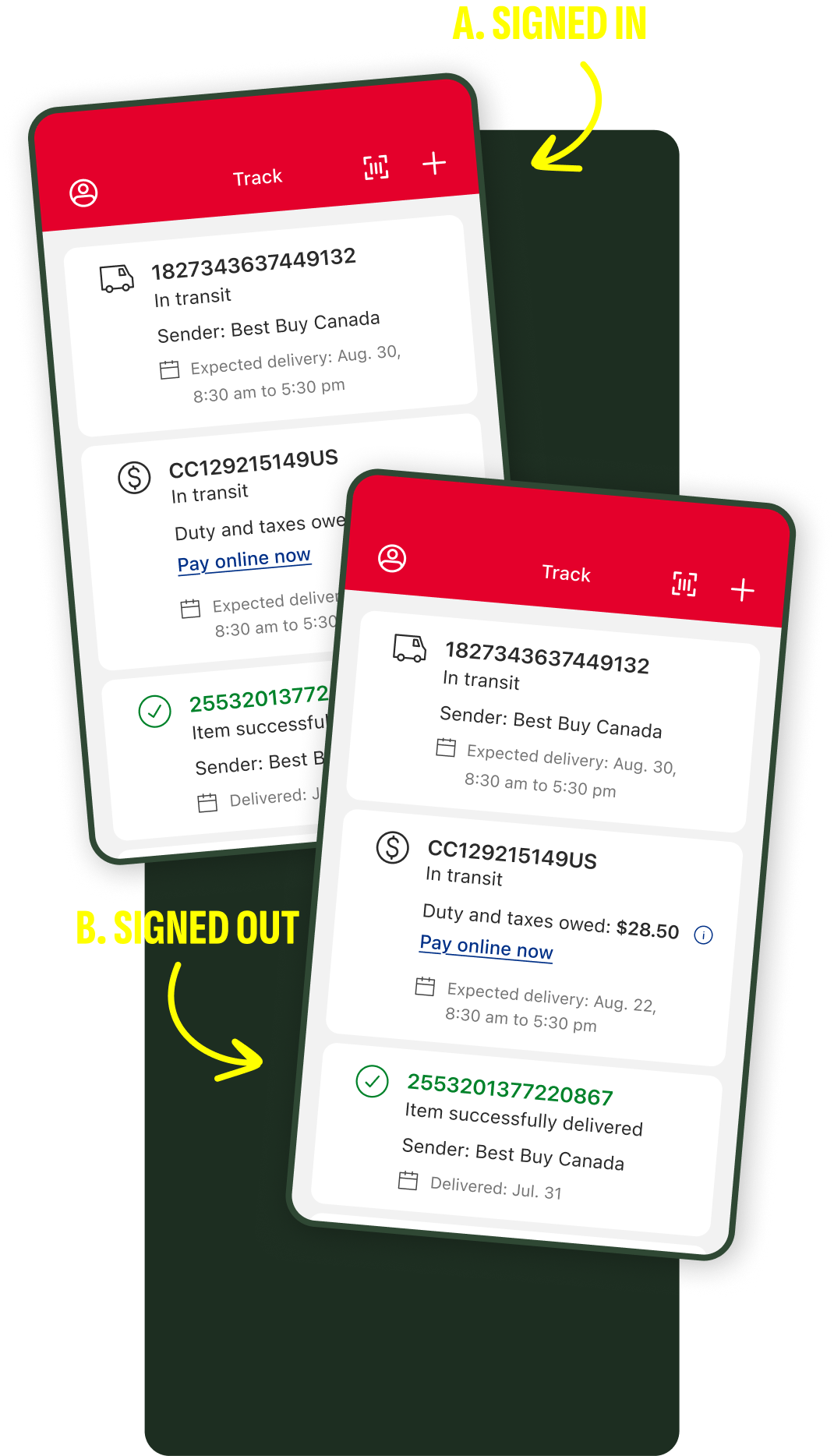
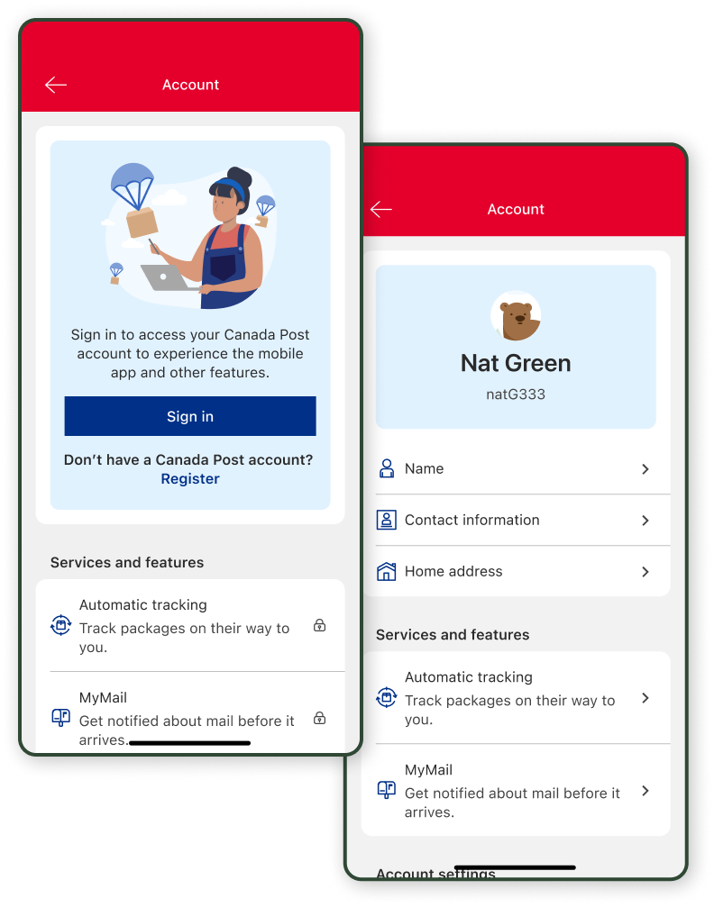
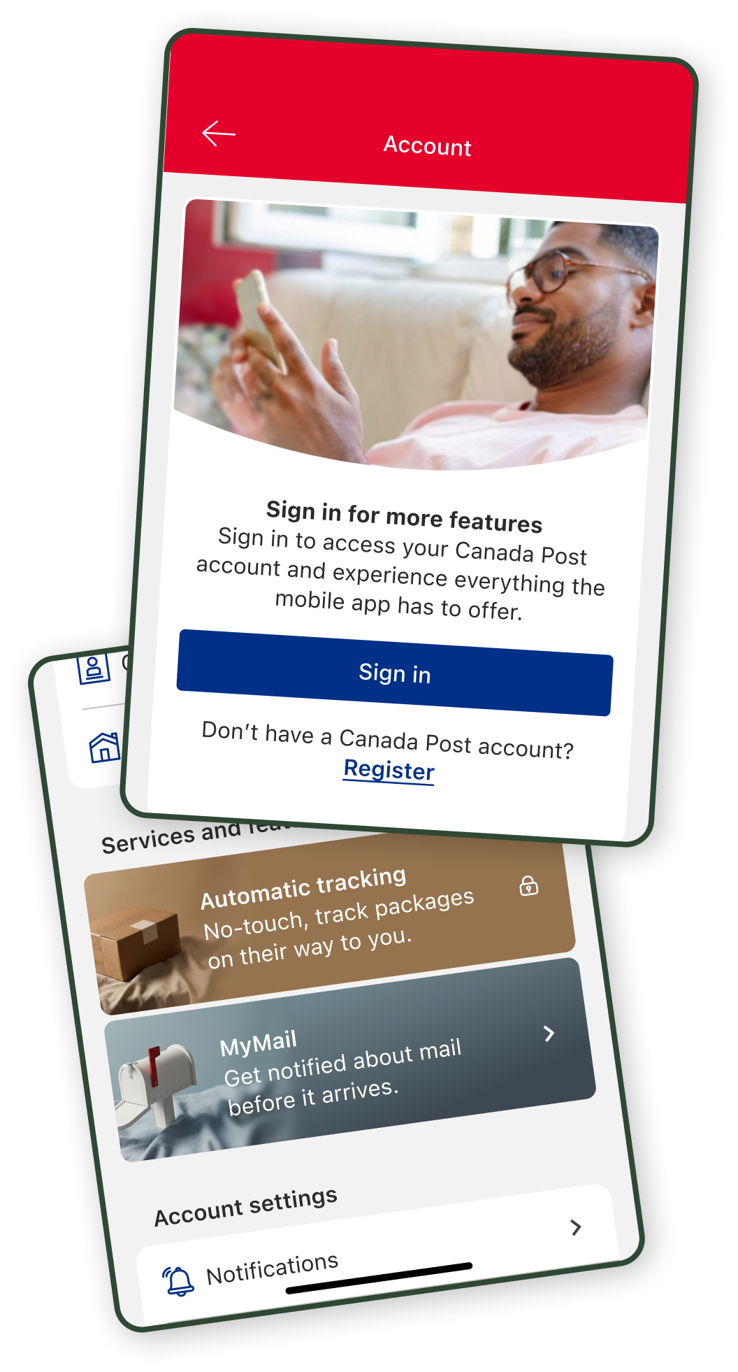
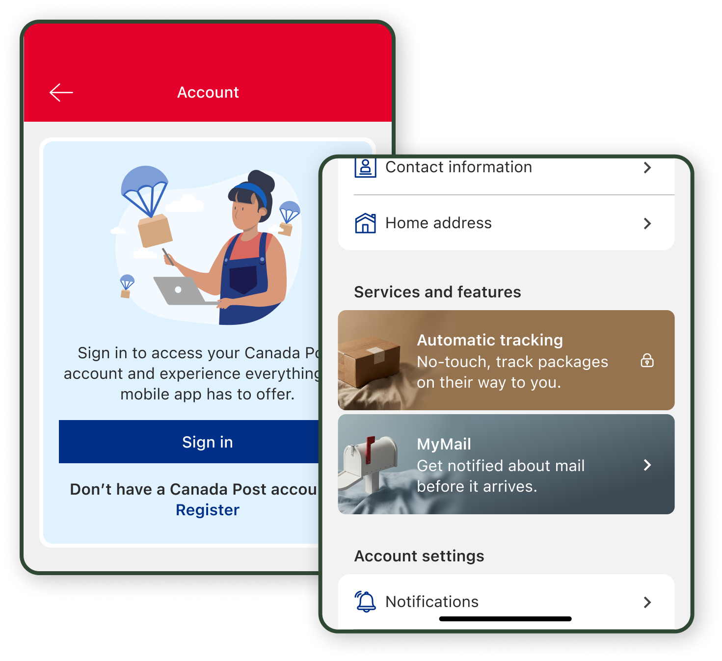
No obvious affordance that communicated whether you were signed in or not.
It sounds silly, but it’s not immediately obvious whether you are signed in or not when opening the app. We also know that our users have low awareness of many of the best features that we have to offer. The combo of those things creates significant headwinds within our core initiative that was to boost registrations at the time.
With that in mind, the thought came to
A) provide a sign in prompt, and
B) tease our available features that required an account.
Not only could people discover new useful features that aided in retention, but it would also serve to quickly inform users of their account and feature status.
Were they logged in? Was their Automatic Tracking or MyMail feature setup? Now they would know.
MyMail and Automatic Tracking usage went up, alongside a meaningful jump in the ratio of logged in users to guest users. Something that we might not have achieved if we had not first asked,
"How might we take it a step further?"
+9%
ratio of signed in accounts using the app
+100%
people using Automatic Tracking within the app
+2%
people using
MyMail
Thanks for stopping by.
Care to chat? Please reach out at
timomarigreen@gmail.com